Methodology
1
SOURCES
2
Processing
3
Presentation

1. Sources
To investigate student academic performance and engagement, we worked with a student performance dataset from the UC Irvine Machine Learning Repository. This dataset compiles student demographic, familial, and educational background information from two secondary schools in Portugal—Gabriel Pereira (GP) and Mousinho da Silveira (MS). It includes key factors such as school type, student sex, age, home environment, and parental education and occupation. By analyzing these variables, we aimed to explore the relationships between external influences and student success, particularly in Mathematics and Portuguese, the two core subjects recorded in the dataset.
To further contextualize academic performance, we examined family-related factors such as parental marital status, family size, and parental support for education. These variables offered insight into how family structures might shape student outcomes.
Before interpreting our data, we critically assessed potential limitations in its collection, structure, and scope. We considered how the dataset’s reliance on numeric indicators reinforces a grade-centric approach to academic success, potentially obscuring other meaningful dimensions of student learning and development.
To complement the dataset, we reviewed peer-reviewed literature on educational inequality, the impact of socioeconomic status on learning outcomes, and broader systemic factors influencing student success. This provided a foundation for understanding how academic performance is shaped not only by individual effort but also by institutional and social conditions. By synthesizing these sources, we aimed to construct a more comprehensive narrative about the complexities of student achievement beyond the limitations of the dataset. More details on our sources and critical approach can be found in our annotated bibliography.
2. Processing
We used Tableau and R Studio for data analyses and visualizations, working with clean and complete datasets that require no additional processing. Tableau provides structured and visually appealing plots with minimal coding, making it an efficient tool for generating clear and professional visual representations. However, its customization options are limited compared to R. R Studio requires a more advanced coding background
but allows for cleaning and reorganizing data. It also offers greater flexibility in creating graphs, allowing for tailored visualizations that meet specific analytical needs. By utilizing both tools, we incorporate efficiency and adaptability, producing visualizations that are both accessible and analytically comprehensive.
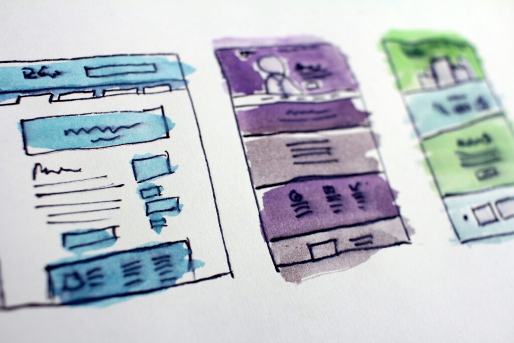
3. Presentation
Our final project was developed using WordPress and hosted through UCLA’s HumSpace portal—a free web hosting platform for students in the Digital Humanities department. WordPress provided our team with flexibility in selecting page layouts and design themes, enabling us to create a user-friendly site.
The Edulytics visual theme was designed with accessibility in mind. To ensure inclusivity for all users, we followed the Web Content Accessibility Guidelines (WCAG). This included adding alt text to images, using high-contrast colors against a white background, and structuring pages with clear headers for easy navigation. Interactive text and buttons were styled in Accent Blue — a color chosen not only for its emphasis and legibility but also for its symbolic connection to “inspiration and wisdom,” aligning with our education-focused research.
We carefully selected the most appropriate visualizations for our quantitative data. All data visualizations were embedded directly into the website, allowing users to interact with each section seamlessly and interpret key insights from each data point.
Learn more about our research
Edulytics